Maps were based on the municipality-specific cancer registry data from each of the five Nordic countries. Collection of high-quality population data and cancer data for such small areas was possible from 1971 until 2015. Cancer registration started in Denmark from 1943, in Finland and Norway from 1953, in Iceland from 1955, and in Sweden from 1958 but the municipality-specific data are not available from Denmark before 1971 (Pukkala et al. 2018). Longer time series have been published for single countries (see, e.g., http://astra.cancer.fi/cancermaps/suomi5308/).
To produce animated maps, cancer incidence rates were calculated for each municipality for 8-year periods 1971-1978, 1976-1983, ..., 2008-2015, adjusted for age using the World Standard Population. The cancer categories were those used in NORDCAN (Engholm et al., 2017, NORDCAN Project page). For some very rare cancer types, longer periods are used.
For some cancer entities (Hypopharynx, Nasopharynx, Oropharynx, Myelodysplastic syndromes, Myeloproliferative diseases, Other hemapoetic diseases, Lip, Other specfied cancers, Unknown and ill-defined cancers, Salivary glands, Skin non-melanoma ), reliable data are not available for the entire period starting from 1971 and these animations therefore start from a later period. Because of some missing data in the subtype-specific of data for leukaemia, only the map animations combining all subtypes of leukaemia are included.
The spatial interpolation of the incidence rates was conducted separately for each country (e.g. not across national borders) using the uniform methodology invented and developed at the Finnish Cancer Registry (Patama and Pukkala et al, 2016).
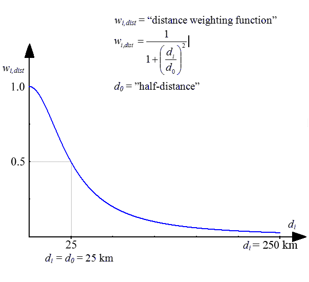
Rates for cities with at least 100,000 inhabitants are shown as circles with a diameter relative to the population size, with the colour shading indicating the incidence rate in that city. The remaining rates are shown as floating averages of several neighbouring municipalities. The rate for each grid (size 2.5 x 2.5 km) on the map was defined as a weighted average of the age-adjusted incidence rates in the municipalities, with population centres within 250 km from the centre of the grid. The weights were inversely-associated with distance; the weight being halved where the distance was 25 km (see weighting function). In addition, the weights were made directly proportional to the sizes of the populations within the 250 km circle. Some rare cancer types have different parameters: population is within 350 km, the weight being halved 50 km.
The northern parts of Finland, Norway and Sweden, and most of Iceland, are so sparsely populated (less than one inhabitant per km2) that even the smoothed rates are prone to a high degree of random variation. A white shading was superimposed on the colours of these areas in an attempt to reduce emphasis on the underlying rates.
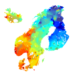
A relative scale is used in all map animations, with 19 colours, ranging from blue and green shadings depicting low rates, to orange and red depicting high rates. A step change from one colour level to another the corresponds to a 1.1-fold relative change in the incidence rate. The lower limit of the highest category is therefore always 5.07 times (1.117) upper limit of the lowest category. The colour scale is fixed, irrespective of the degree of geographical variability for a given cancer site. Hence a map with only few colour shades indicates that there is only little geographical variation in the incidence.
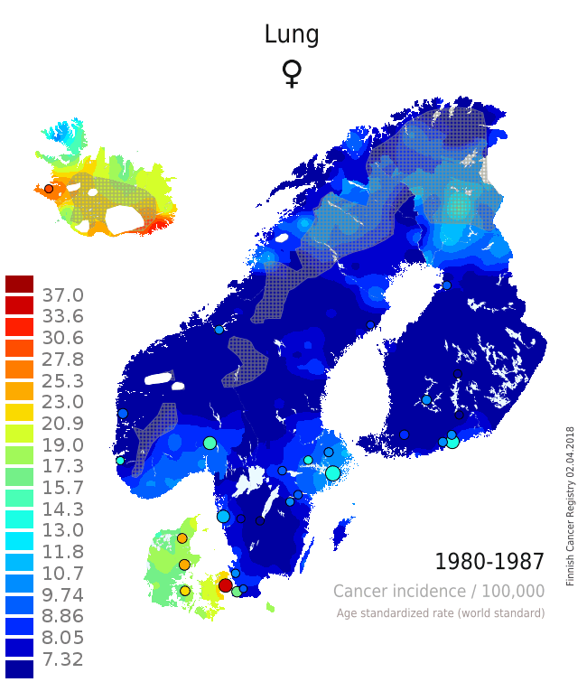
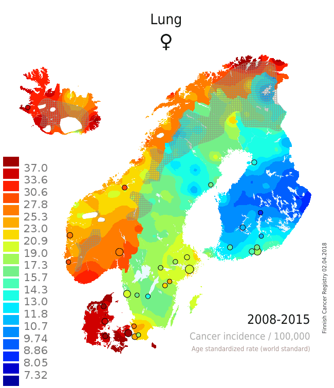
There are several issues that can be seen from the single maps and from the animation that adds the component of temporal change on the layer of spatial variation (Patama and Pukkala, 2016). The pair of maps from the two time periods 1980-1987 (Map 1) and 2008-2015 (Map 2) is used as an example of interpreting spatio-temporal trends in female lung cancer (see the full animation here). In the first period, lung cancer in women was a rare disease in all Nordic countries except in Iceland and Denmark. In all countries, incidence was highest in the capital city. In the latter period 28 years later the incidence was much higher everywhere. The relative increase was especially high in Norway, while there was only little increase in rural Finland. These observations can be easily linked to variation in smoking prevalence over place and time. Sparsely habited areas are covered with a grey screen, and waters and ice caps are left white.
|
⇨ |
|
| Map 1: Female lung cancer incidence 1980-1987 | Map 2: Female lung cancer incidence 2008-2015 |
- Engholm G, Ferlay J, Christensen N, Hansen HL, Hertzum-Larsen R, Johannesen TB, Kejs AMT, Khan S, Ólafsdóttir E, Petersen T, Schmidt LKH, Virtanen A and Storm HH: Cancer Incidence, Mortality, Prevalence and Survival in the Nordic Countries, Version 8.0 (20.12.2017). Association of the Nordic Cancer Registries. Danish Cancer Society, 2017. Available from http://www.ancr.nu, accessed 8 May 2018.
- Patama, T., Pukkala, E.: Small-area based smoothing method for cancer risk mapping. Spat. Spatio-temporal Epidemiol. 2016; 19: 1-9 (http://dx.doi.org/10.1016/j.sste.2016.05.003).
- Patama T, Engholm G, Klint Å, Larønningen S, Ólafsdóttir E, Christensen N, Storm H, Pukkala E. Small-area based map animations of cancer incidence in the Nordic countries with new entities, 1971-2010. Nordic Cancer Union 2014: http://astra.cancer.fi/cancermaps/Nordic_14, accessed 8 May 2018.
- Pukkala E, Patama T, Engholm G, Ólafsdóttir GH, Bray F, Talbäck M, Pasanen K. Small-area based map animations of cancer incidence in the Nordic countries, 1971-2003. Nordic Cancer Union 2007: astra.cancer.fi/cancermaps/Nordic7103, accessed 8 May 2018
- Pukkala, E., Engholm, G., Højsgaard Schmidt, L.K., Storm, H., Khan, S., Lambe, M., Pettersson, D., Ólafsdóttir, E., Tryggvadóttir, L., Hakanen, T., Malila, N., Virtanen, A., Johannesen, T.B., Larønningen, S., Ursin, G.: Nordic Cancer Registries – an overview of their procedures and data comparability. Acta Oncol. 2018; 57: 440-455.
